

This new interview series – Art Inspired Conversations with Randall Hasson – reflects something that has been years in the making for both of us: an art inspired conversation about the creative life and its interweaving with the life of faith.
While we met for the first time face to face in Houston in 2013, I had been aware of Randall Hasson’s work for many years before and I have desired to own one of his pieces for House on the Way since my first encounter with his art (which was, incidentally, the C.S. Lewis painting for the C.S. Lewis Foundation). Randall’s painting style is unique and it represents a superb example of reason, imagination, and spirit intertwined. The layered nuances of text-over-image speak to me personally as very few styles of painting ever have. It is not only the visual beauty of Randall’s colour ranges and human figures that draw me in. It is the combination of them with the weaving of words – words bearing truth and meaning. In Randall’s work I see the richness of word and image made visible as single entity. Symbol, vision, and mystery are revealed as though the veil of Heaven has been pulled slightly back allowing a glimpse of what is yet to be our full experience. No other living painter creates works of art that have a stronger influence or sing so beautifully to me. I am grateful a thousand times for Randall’s faithfulness to his craft. He inspires me as an artist, encourages me with excellence and comforts me with hope.
And yet for all the excellence of Randall’s work as an artist, I am often more mesmerized by Randall himself as a work of art by God’s hand. Few people I know create the depth of art that he does and yet carry themselves so lightly with others. From the moment one meets him, Randall is full of energy, attention and mirth. Mirth is a quality all too rare these days and yet it is just as potent as it ever was to serve as a truth-bearing agent and defense against the darkness.
C.S. Lewis wrote this in his extraordinary sermon The Weight of Glory:
“There are no ordinary people. You have never talked to a mere mortal. Nations, cultures, arts, civilisations – these are mortal, and their life is ours as the life of a gnat. But it is immortals whom we joke with, work with, marry, snub, and exploit – immortal horrors or everlasting splendours. This does not mean that we are to be perpetually solemn. We must play. But our merriment must be of that kind (and it is, in fact, the merriest kind) which exists between people who have, from the outset, taken each other seriously – no flippancy, no superiority, no presumption. And our charity must be a real and costly love, with deep feeling for the sins in spite of which we love the sinner – no mere tolerance, or indulgence which parodies merriment.”
Randall reminds me of this passage through and through. He brings the spirit of play to conversations and in his merriment he also extends dignity to those in his company. To talk with Randall is to feel what it is to be “seen”, acknowledged, and elevated as a human being. This is the true art.
Allow me to introduce you to artist, calligrapher and friend – Randall Hasson.
The meaning of the mission
LES: Randy, it is such an honour to be doing this interview with you! So many fascinating directions we could go given the range of your work. Could we start with something very foundational? Would you tell us about your mission statement?
RMH: I’m going to invite my wife Valerie to chime in on this opening question as she has been intrinsically involved in this since the beginning and really was the one drafting our mission statement.
VH: Randy began something by combining Hand Drawn Calligraphy and Image. That was not common at the time…especially in large format paintings. The goal was the creation of Art that left people inspired, moved, changed, challenged and encouraged. The work was meant to cause the soul/viewer to contemplate the ideas on the paintings in a deeper way and see the “WORD” become live in the viewer – combined with the image. Many of the paintings have Scripture on them – meant to sink in and inspire/change and move the viewer by the “Spirit” if you will.
Ultimately the hope/intent was to leave our current generation with another form / different kind of ART work…as many past artists have done. A “legacy” [1 : a gift by will especially of money or other personal property : bequest. 2 : something transmitted by or received from an ancestor or predecessor or from the past <the legacy of the ancient philosophers]
Randy has created a body of work like none other. This has been the overriding comment by viewers for many years. While people combine in collage words and image…this particular style of delivery has been unique and we hope will be experienced by future generations as such in years to come. The paintings have been recognized to create dialogue, conversation and contemplation.
Our goal in the Gallery was to sell the paintings…to distribute them into homes and lives first and to generate funds that could be given away.
We did that over the years by supporting various ministries and causes. Randy and I both worked during this process and nearly 100% of the funds generated from the Gallery were reinvested in the business or given away.
Most Artists do art because they are “unable” – unable not to do it.
To that end…many artists collaborate with various social and community organizations to get work out and into the hands of the people via many charitable and public pursuits. We are not at all unique in this mission. I believe that Artists GIVE /DO a lot for their community and causes.
LES: What is the drive behind inspiring other Artists to share their gift?
VH: Randy has since the very beginning…taught, lectured and shared his gift. He was born with it and he has always sought to help other artists and especially INSPIRE them to use the gift they have. He was trained in Calligraphy but was Not trained as an artist. That is amazing to me (a non artist). We opened our own gallery – not really knowing much about that because I believed his work was something to share/show. But later – we began to understand how hard it is for New Artists to get their work into galleries. So – in our fifth year…we also began showing other artists. We opened up the gallery to others and hosted shows and events to share their work.
Art that inspires conversation
LES: You have this statement on your website: “Randall joins word and image to the page to create Contemplative Paintings meant to inspire the process of contemplation in the viewer. The depth and complexity of the paintings invites serious pondering…” Why is your focus on the contemplative? And why the focus on art that is inspires conversation? What is the significance of contemplation to you and why do you focus your art on that?
RMH: Well, let’s take the contemplative aspect first. It really is the foundation of the intent behind the work. I believe that we as individuals have many layers to our being. James Clavell, in his novel Shogun, speaks of an individual having six faces and three hearts.[1] This is an insightful illustration of the layers that comprise our personality and our soul. An individual can exhibit a variety of “faces” – outward appearances, one shown to the public, another shown to friends, and yet another with our closest confidants. Similarly, there is the depth of the levels of motive in our hearts that we have with public, family and our own innermost hopes and desires.
Correspondingly, these paintings are intended to have a variety of levels of depth with which the viewer can engage. Visually, there are usually a couple of elements that can be seen from across the room. The viewer can appreciate an image or two, and read perhaps one main text from a distance, but will need to physically move closer to the painting to read most of the text, and become still more intimate in order to decipher the smallest, and sometimes most important visual elements. In each painting, there seems to be some text that is fairly hard to decipher, and it doesn’t bother me that the viewer has to ‘earn’ the quote. My view on this is that I don’t necessarily care if the viewer can read every letter or even every word, but I do care that if they want to, they will be able to ‘read’ the whole quote – so one might have to work a little harder to apprehend some of the text in my paintings.

- Family Blessing – detail – Copyright Randall M. Hasson
The painting that was the first to be completed in this ‘contemplative’ style is called Family Blessings. I say this in quotes because I didn’t really have the word ‘contemplative’ designated at the time – it came later as a descriptor. Family Blessings was painted for my brother and sister-in-law who, while their house was being built, had ‘blessed’ it by writing their cherished scriptures inside the walls before the drywall was hung; the text of the painting contains those scriptures. The process itself was contemplative because of the mechanics of constructing the painting compositionally and including symbolic and textual elements.
Research is a key component; even if my viewer never asks the question, I feel I need to have the reason or rationale of why I placed elements where they are or how they appear in the finished work. Sometimes it can be as simple as a color choice or as complex as the incorporation of an image like the Libyan Sybil from the Sistine Chapel Ceiling – thought by many to be one of the most beautiful poses that Michelangelo painted. A Sybil is an ancient prophetess outside of the Christian tradition that is included in that seat of Christian worship, and on that ceiling there are six prophets and six sibyls. Why? I couldn’t find any satisfactory explanation from the art historians – but for me it was the epitome of “every knee shall bow and every tongue confess…”
Compositionally, I worked with symbolic lines, arcs and blocks, all grouped in threes to represent the trinity. The visual elements echoed this as well, and when it came to the writing of the text itself with the actual lettering, I had to think three or four moves ahead: if I write this text in this color and in this style, and then write something else across it, how will the viewer be able to read it? The result of this fairly complex process is that in my practice of painting I end up staring at the canvas far longer than I actually paint on it – I basically wait until I know what to do… have a ‘conversation’ with the painting if you will.
Now we come to the phrase “Paintings that inspire conversation”. This actually isn’t a focus, but an effect. The phrase came about as a result of some research I was doing into branding for a marketing course I was taking in order to complete my long overdue Bachelor’s degree. I had the luxury of a clientele with which to ask opinions, so I sent out a list of questions to collectors and asked them to help. I know from the personal experience of operating a gallery for 13 years that, again and again, visitors would say about my paintings: “I have never seen anything like this”. In my survey, the most universal response I received was that the people who came to the collectors’ homes would see the paintings, walk over to them, and begin to read – and a conversation would begin.
A journey to an artist’s identity
LES: You were formally trained as a Calligrapher and have a BFA in Fine Art. But you did not always make your living as a fine artist calligrapher. How did you transition from working in the professional industry you were in before to fine art? What drew you to calligraphy and to kind of art you make incorporating words with images?
RMH: I began to be interested in art in High School and pursued the study in college. My High School art teacher in 1978-79 was an old commercial artist and introduced us not only to the varieties of art that included drawing and oil, acrylic and watercolor painting, but also lettering and calligraphy. Moving on from high school, I was able to get a job in the “art department” at Long Beach City College, which basically meant that teachers would come in and ask for signs for their class. The man who ran that department was an old letterer that knew quite a few tricks of the trade, and being associated with him resulted in learning the basics of using pens for lettering and techniques for simple illustration; I have come to realize now that these little classroom signs had their roots in the American tradition of “show cards”.
I had also worked in a retail swimming pool supply through high school, eventually co-managing the store through college. I had always been impressed with the life of the sales reps that came into the store… they dressed well, drove nice cars and came to visit, shoot the breeze and get our business. When I met my blushing bride and eventually asked her to marry me, I had a choice to make: try to make a living in art or actually make a living in sales. My new wife had something to say about that; her dad was extremely successful in the insurance business. I went and got advice from him and forged ahead into the life of a sales rep for the next 25 years.
I had really left the art behind during this time until the mid-1990’s and the recession. During that time, my production went up about 10% per year and my income went down 10% per year. I needed an outlet to do something creative so I decided to teach calligraphy, figuring that I’d have to study harder in order to teach. At the same time, I was given a book of calligraphy by Timothy Botts that illustrated the Psalms and it captured my imagination. I began to teach a class at a local Michaels Art Store and tried to emulate some of the calligraphy I saw in that book and in another important book I owned, the Speedball Textbook. As the class progressed, I began to have other questions on technique, so I began to look for a class or teacher to learn from, and in doing so I was referred to a formal program about an hour and a half from my home. I didn’t know it at the time but that referral would change my artistic life.
It is one thing to see calligraphy in a book, and quite another to see an accomplished artist execute a letter in person. To the layman, it is usually astonishing. As soon as I attended my first class with Marsha Brady at Cerritos College, I stopped teaching and devoted the next four years to the study of calligraphy. The projects covered the broad range of lettering and calligraphy including tools, materials, theory, and techniques. Not only did students learn lettering, but also bookmaking and binding, presentation methods and framing techniques. Historical lettering styles were the focus of each semester’s projects of this two year program, and many of the serious students including myself went through at least twice.

- Remembrance1 – Copyright Randall M. Hasson
As my comfort with tools and materials progressed, I began to want to include imagery with the lettering more and more. It had been about 15 years since I had done any real artwork, and when I began to gravitate back to artwork, the look of what I was doing had changed. It had matured I think, and I was seeing things differently. No longer was I being influenced by my instructors and their techniques from long ago, I was just simply doing the things that I wanted to see on the page or the canvas. The first real clue as to what might take shape came in the form of street painting.
I Maddonari is a street painting festival at the Mission Santa Barbara in California that is used as a fundraiser for art charities every year. Basically they cordon off the whole parking lot, sell the spaces to sponsors who in turn hire or designate artists to create artwork in pastels in the allotted space. Normal spaces are the size of a regular parking space, and feature spaces can be almost mural size. The Society for Calligraphy sponsored a space and I found a partner who would do the lettering while I would do the artwork. We decided to do an illuminated manuscript page and I chose the figure of a monk as the illustration. In prep for the project, I took pictures of a friend dressed up in a robe and decided to do a painting as a study – my first oil painting.

I had stayed up late into the night to do that painting. My wife is an early riser, and when she walked into my study she says the painting took her breath away – she realized at that point that I was really an artist. She had remembered my earlier, naive attempts at artwork when we first were married, and could immediately see the difference between then and the more mature work before her. This incident and one other helped make the transition from business to art.
I continued to explore this combination of imagery and text, and continued to work with paintings as studies for the larger compositions. In my insurance travels, I had a client that was a business analyst and a consultant for large corporations. By this time I had done a couple of paintings in what was to become my trademark style, and I had an oil portrait in my car when I called on him. He saw it in the back and asked me about it, and as he looked at it and some other work from my portfolio, he said something that would make a great impact on me: pointing to the painting, he said
“Oh I see, insurance is what you do, but this is who you are.”
A short time later, in the year 2000, my wife came home and declared that she had found a commercial space in the Design district close to our home. “For what?” I said. “Your gallery” she replied. I put my foot down and in no uncertain terms told her “There is no possible way I am doing that”. Shortly thereafter we signed a lease and began renovations on the space to make a gallery area in the front and a studio and office in the back.
We operated under the principle of “don’t quit your day job” and so I continued my insurance practice while I developed the artwork and collector base. We operated that studio/gallery for 13 years, the first 5 in the Solana Beach gallery, moving our operations to Santa Fe NM for the next 8 years. The time for operating came to an end in the fall of 2013, when we closed so that I could concentrate on painting, writing, traveling and teaching.

- Hasson Gallery 1

The importance of symbolism
LES: Looking across the body of your work, it is very apparent that symbolism is an integral part of your compositions. Why is symbolism so important to you? What is at stake in the use of it?
RMH: Throughout history in societies across the globe, symbols have served to communicate ideas. The fact that you are reading this text right now illustrates the fact; letters are graphic representations – symbols- that represent the transitory sounds of speech. The subject of symbolism and its use in art fascinates me. While our society today has abundant examples of symbols in our everyday life, the visual language of symbolism in the world of art has largely been lost to most viewers. Because of the visual presentation in the artwork I seek to create, adding an underlying language of symbolic content serves to deepen the multilayered experience for those who are interested in that level of meaning.
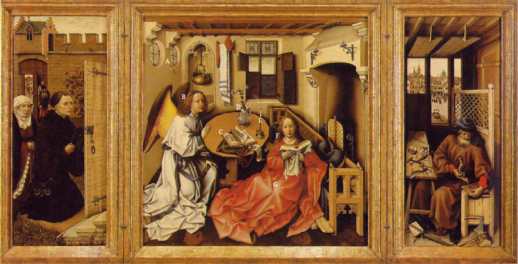
If we take a slice of history, say Europe of the 15th and 16th century, only a small percentage of the population was literate. European artwork was mainly commissioned by the Church to tell stories and illustrate biblical truths and the artwork was full of visual allegory that an illiterate viewer could easily understand. The use of colors and imagery depicting animals, botanicals, objects, angels, saints all were woven together to create a visual narrative that would serve to teach or remind viewers of principals and truths both philosophical and spiritual. Each of these symbols had their own meaning, and further, the meaning would change depending on the setting in which that symbol was placed. [2] The image above, the Merode Altarpiece, is an example that is full of symbolism (click to read about it).
In addition, the actual composition of a painting could be symbolic as well. Hidden mathematical constructions imbued meaning into sacred art, and artists used measurements (such as the golden proportion) for their lines of composition that are not readily apparent to a viewer. As an example, early paintings, triptychs and altarpieces used vanishing points that converged on a focal point that highlighted the most important subject – common examples would be the Christ or the Madonna.[3] Sacred artwork such as the illuminations found in the miniature books of hours was planned to fit and conform into underlying mystical mathematical shapes, and in the high Renaissance some artists used musical ratios in their paintings to define the proportions and placement of objects and figures in their compositions.[4]
Because symbolism is not readily apparent at first glance, I usually write a detailed explanation of how I arrived at the finished product. I believe that artwork can serve as a visual sermon, not only the finished product but also the painting process and the decisions that are made during that process – the ‘whys’ of the artwork.
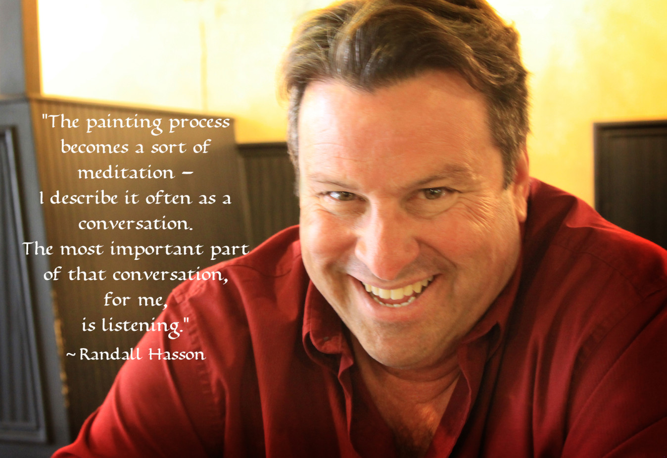
This process becomes a sort of meditation – I describe it often as a conversation – and the most important part of that conversation, for me, is listening.
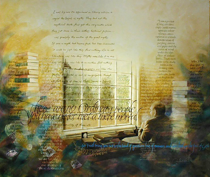
Perhaps the two most documented examples of this process in my work are the C.S. Lewis painting and The Evangelist, a painting commissioned by Hobby Lobby.
- CS Lewis painting- Copyright Randall M. Hasson
Of themes and techniques
LES: You use multiple texts in your paintings, Randy, most often with varying weights of pen nibs and even letter styles. It creates a beautiful complexity visually and intellectually. What do layers of text accomplish in your work and how did you begin to use this approach? Why not be content with a single set of words in an image?

- Family Blessings Framed – Copyright Randall M. Hasson
RMH: Well you’ve asked a couple of different questions with a couple of different approaches both practically and philosophically. I am going to take these in reverse order if you don’t mind, because answering the last will provide groundwork for the first.
You asked earlier “Why not be content with a single set of words in an image?”
The first painting I completed in what I would call ‘my style’ was a collection of quotes that a family had used to bless their new home; Family Blessings contained a significant number of scriptures. The next painting was done for a company who had a multi-layered philosophical mission statement, and Providence again contained a significant amount of text that had to be handled in a cohesive fashion. This began to establish a concept of visually articulating philosophy through a combination of text, imagery and symbolism. It is a mentally stimulating and challenging process that involves thinking quite a few ‘moves ahead’. While two other early paintings were treatments of the specific poetry of my wife Valerie (Repentance and I Remember), I continued to gravitate towards a themed approach… in other words I would establish a theme, and then research the quotes, text and imagery that would fit that theme, and then enter into a process of putting it all together visually.

- L’ESPRIT – Copyright Randall M. Hasson
The painting L’Esprit completed in the year 2000 provides an excellent illustration of this thematic direction. This was a painting that became a study of the principles and philosophy of art. There were visual elements that I wanted to explore: using text as a background texture, using simple compositional ratios based on those proportions I had studied in renaissance art, and taking the layering and glazing of paint into more depth. The broad theme encompassed the philosophy of artists about their art, and the title is taken from a statement by Picasso: “Art should not be a trompe l’oeil but rather a trompe l’esprit.” Trompe L’oeil is a visual deception, to trick or fool the eye, and one of the definitions of Trompe L’oeil is “a painting or design intended to create the illusion of a three-dimensional object”. Hopefully the art I was creating would use visual trompe l’oeil devices to take the viewer to a deeper level – a spiritual dimension.
In regard to your question “What do layers of text accomplish in your work and how did you begin to use this approach?” let me respond with this. That spiritual dimension is one of the layers in our personality and soul, and therefore the art somehow needs to reflect those levels in a visual presentation. Using layers that overlap is a visual allegory –layers of text are not on a parallel plane graphically separated or ‘designed’ like a poster or advertising image might traditionally be separated from the text. This reasoning means that the text I choose needs to be in space or in perceptual depth, to visually create the illusion of the multitude of thoughts and ideas that come into our minds, not necessarily in an orderly linear fashion but many times in a simultaneous swirl. Using trompe l’oeil techniques (in a rough sense) helps to accomplish this illusion with lettering; therefore it is necessary, if I am going to use multiple quotes and text on a subject or theme, that this matter will overlap each other and the imagery.

- LESPIRIT-IsabellaDetail – Copyright Randall M. Hasson
We all have important influences which we use as a springboard, either consciously or unconsciously, for our own creativity. One such important visual influence was a painting by Thomas Blackshear called Swan Song. I remember where I was when I saw it. Time stopped. I wasn’t even back into my art at the time, but it inspired me and got me going again, and its influence can be directly seen in my exploration of depth in L’Esprit – the main figure is surrounded in depth, front and back, by the text even as the Native Chief in Blackshear’s work is surrounded by swans front and back. This was unconscious – I didn’t remember until some years later the effect that painting had on me, but its influence is clear in this work and subsequent paintings.

- Thomas Blackshear – Swan Song
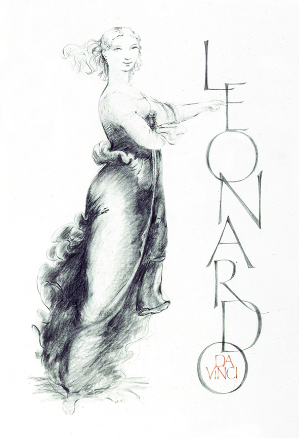
Another influence is Leonardo da Vinci’s study of atmospheric perspective – the concept that when there is more atmosphere between the viewer and an object, say a mountain, the less distinct and more muted that object becomes. This translates into the blueish mountains we see in the distance of many landscape paintings. Okay, that is clear: the closer the object the sharper the focus, the farther the object the less distinct. But how does that translate to abstract images or symbols, like the letters which form words. The artistic journey I have taken in this direction has been a continual evolutionary process to see if I can effectively place those words into an atmospheric and spiritual depth.
Thanks for your comment here (as it is phrased above) and the question you alluded to. “You use multiple texts in your paintings, Randy, most often with varying weights of pen nibs and even letter styles. It creates a beautiful complexity visually and intellectually. Why?”
This brings us to the last (actually first) question… and the easiest probably because it is simply a practical application. If I am going to write a block of text, say in dark blue and in an italic hand, then how do I need to adjust the next quote that I write across the first so that both can be read by the viewer? This is where the elements of contrast come into play. I need to use differing calligraphic hands to differentiate the layered text and these are chosen for reasons of contrast: size, weight (how light or heavy the lettering is), color, slant, direction, and opacity all play a part in the planning process. In addition, the interpretation of the quote determines the appropriateness of the lettering I choose, throwing in an extra wrinkle: an elegantly flourished copperplate script used for weddings is hardly appropriate when speaking about the dust and sweat and blood of Theodore Roosevelt’s famous Man in the Arena text.

- Man-in-the-Arena Copyright Randall M. Hasson
With all these things in mind, it is common for me to wait until I have thought out and written out two or three ‘moves’ ahead before I commit a block or line of text to the painting. I sometimes have to ‘sacrifice’ text, but in most cases if the viewer wants to, they will be able to ‘read’ every quote on the painting because of all of these contrasting lettering styles. This is not to say it is easy, and it is not to say they will even be able to ‘see’ all of the quotes at first glance. For me, that is a part of the contemplative spirit of the artwork; the discovery of new elements as time passes. I said before I don’t mind making a viewer ‘earn’ the text, but I definitely want them to be able to figure it all out if they want to. Some can get all of it from simply viewing the painting, and some will gain the understanding by reading the explanation, still others are content with the outer level of the imagery and the one or two quotes they can read from across the room… whatever works.
Colour use and motivations
LES: You seem to be primarily drawn to earth colours in the majority of your paintings – colours that are strong but muted and peaceful. When you use brighter colours, they shine like jewels but are never harsh or loud. What pulls you to this spectrum of colours and why do they seem to serve your texts best?
RMH: Perhaps it is a misplaced love of the techniques of the masters of the past, and perhaps it is because I paint with ‘value first’ in mind – value means the correct proportion of darks and lights to model form. Perhaps philosophically it is because I like to build up depth with layers and glazes of paint, and certainly it is because in any painting, there are areas which I want to emphasize by the use of color.
And maybe, just maybe, some of it has to do with the fact that I paint out of fear.
Okay there, I said it. Fear.
Fear is not always a detriment… sometimes I feel it is healthy if properly channeled. It can be a great motivator to do better, and maybe it has a little to do with our competitive nature… many times it can spurs people on to a higher level of achievement. In my case it is a sense of knowing my own limitations. You are probably saying to yourself right about now – what the…?!?! Where did that come from and what does it have to do with color?! Let me explain…
Many very accomplished artists are excellent draftsmen. I use that word in the sense of one who can draw well, who understands form, and can seemingly effortlessly use line to depict a subject, sometimes with just a few strokes and with great accuracy. I am not one of those. Never have been. However, I can pass reasonably well as a good renderer. By this I mean one who can render shape and form by shading and blending. Give me a pencil and tell me to make a line drawing and I’ll often fail (to my eye), but give me a pencil or some paint and tell me to take my time and use shading and texture to get the look I want and I will usually be successful. Over time.
Leonardo da Vinci wrote, in his notebooks, something that causes me to wait until I am sure that a painting is right: “If on your own or by the criticism of others you discover an error in your work, correct it then and there, otherwise in exposing your work to the public you expose your error also. Don’t make excuses, persuading yourself that you will retrieve your reputation in some future work, because your work does not fade when it leaves your hands like the sound of music, but remains a standing monument to your ignorance.”

- Holly Headwrap Final – Copyright Randall M. Hasson
So part of the reason that I use peaceful muted colors in my paintings is that they are a base for the rendering of the forms I am painting. Underpainting like this is a traditional ‘old master’ technique, and it suits my personality well, allowing me to go slow. I will use sienna, umber and white for example in order to get the dark and light values of the form correctly rendered. I use thin layers of paint and build up the values, making visual adjustments as I go. If I am doing a portrait, I must have everything in the right place – if I am painting a tree it doesn’t really matter if a branch is a quarter of an inch off, but if the eye is wrong the whole portrait fails. Sometimes I have worked on a portrait for so long that I can’t “see it” anymore, and I have to walk away until tomorrow or the next day. Sometimes it will sometimes take me a couple of days to get it right… and coming back and seeing it fresh helps to see where things aren’t right. Viewing a painting in a mirror helps too.
Once the proportions are correct, and I have an accurate likeness of the individual, I now have what I think of as a mechanically correct image. Sometimes I stop there because it has the feeling I want, as in The Writing Lesson of 2002. If I am going to continue with color, there is then a point where the painting comes ‘alive’. I don’t know how to explain it, but that is what happens. Using those base colors, it doesn’t take much to make it happen – a thin transparent glaze of red, a little blue, perhaps some yellow or orange. So a part of the reason that my colors are muted is that they are not necessarily pure color painted directly on the canvas… you are looking through the color, or glaze, to the form that is underneath. I will just keep working until the values and the colors are right to my eye.

- The Writing Lesson – Copyright Randall M. Hasson
And then there is color for emphasis, so in certain images I will visually direct my viewer by the intensity and contrast of color. In my images, the strongest color contrast usually is the place with the most visual emphasis – the coolest color next to the warmest will draw the eye first. Pay attention to the next newscast you see on television – you’ll see the warmth of the broadcasters face set into a backdrop of a brilliant cool blue – that contrast is what keeps your eye fixed on the reporter. The same principle applies to the colors I choose for the text – some are foundational and some need to be emphasized, so color can play a part in that also. Usually but not always, I feel white serves to bring text forward to the viewer, therefore many times white will be used for the main or emphatic quotes on a painting.
In other paintings there are symbolic reasons for the colors I use. The most symbolic might be in that C.S. Lewis painting where the swirling strokes of color are used to symbolize the color, depth and texture of Lewis’ imaginative thought and as they swirl they mix and overlap making new colors. Those colors are also inspired by his writings; descriptions of the colors in Perelandra in his Science Fiction trilogy. They tell me that even though Lewis was outwardly a very brown man, he thought in color and light[5]. Other paintings such as The Evangelist have a more traditional color symbolism: Purple for royalty, white for purity, etc.

- C.S. Lewis Painting detail – Copyright Randall M. Hasson
In short, though I have tendencies for my color and it is informed by my choice of materials, color for me is a tool of communication that sets a mood. Many times it is an echo of the ancient, and sienna and umber set that mood very well. Since I want my paintings to be inspirational and yet soothing and meditative, I will use color as a means to an end, but not as an end to itself.
![]()
Footnotes:
[1] Clavell, James. Shogun. 1975. Print. “It’s a saying they have, that a man has a false heart in his mouth for the world to see, another in his breast to show to his special friends and his family, and the real one, the true one, the secret one, which is never known to anyone except to himself alone, hidden only God knows where.” And: “The Japanese have six faces and three hearts. A deceitful heart in their mouth to show in public; another heart in their chest that only friends and family get to know; and at last their real heart that nobody knows and that remains hidden in an undisclosed location.”
[2] While the study of symbolism is too vast to delve into here, numerous books and website have treated the subject. One such is http://www.historyofpainters.com/symbol.htm
[3] One of the most famous and refined examples of composition lines that converged on a focal point would be the well documented painting of the Last Supper by Leonardo during the High Renaissance.
[4] Raphael’s classic School of Athens and paintings by Giorgione are examples of artists using musical ratios in their artwork. A classic and comprehensive study of these compositional principals is: Bouleau, Charles. The Painter’s Secret Geometry ; a Study of Composition in Art. New York: Harcourt, Brace & World, 1963. Print.
[5] What I mean by Lewis being a “brown man” is that his exterior life was very routine: a paper, tea and his pipe in the morning, teaching in the afternoons, the eagle and child pub with colleagues in the evening, discussions with the inklings…and do it all again the next day. His world was gray and brown and brilliant green and filled also with tobacco smoke. He wasn’t a daredevil or world traveler. His world, like many scholars before and after him, was largely interior and colored brilliantly with his imaginative thought…
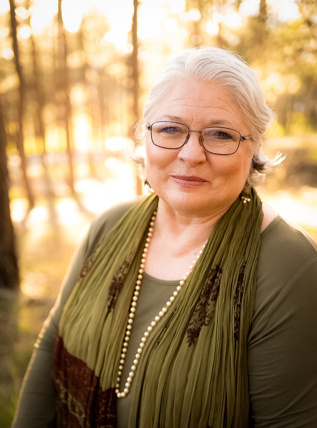
The featured image of Randall Hasson is courtesy of Lancia E. Smith and used with her permission for Cultivating and The Cultivating Project.
For a further reference regarding the Golden Ratio in art, see https://artignition.com/golden-ratio-in-art/
Lancia E. Smith is an author, photographer, business owner, and publisher. She is the founder and publisher of Cultivating Oaks Press, LLC, and the Executive Director of The Cultivating Project, the fellowship who create content for Cultivating Magazine. She has been honoured to serve in executive management, church leadership, school boards, and Art & Faith organizations over 35 years.
Now empty nesters, Lancia & her husband Peter make their home in the Black Forest of Colorado, keeping company with 200 Ponderosa Pine trees, a herd of mule deer, an ever expanding library, and two beautiful black cats. Lancia loves land reclamation, website and print design, beautiful typography, road trips, being read aloud to by Peter, and cherishes the works of C.S. Lewis, J.R.R. Tolkien, and George MacDonald. She lives with daily wonder of the mercies of the Triune God and constant gratitude for the beloved company of Cultivators.


A Field Guide to Cultivating ~ Essentials to Cultivating a Whole Life, Rooted in Christ, and Flourishing in Fellowship
Enjoy our gift to you as our Welcome to Cultivating! Discover the purpose of The Cultivating Project, and how you might find a "What, you too?" experience here with this fellowship of makers!
Add a comment
Comments Off on Art Inspired Conversations – Randall Hasson